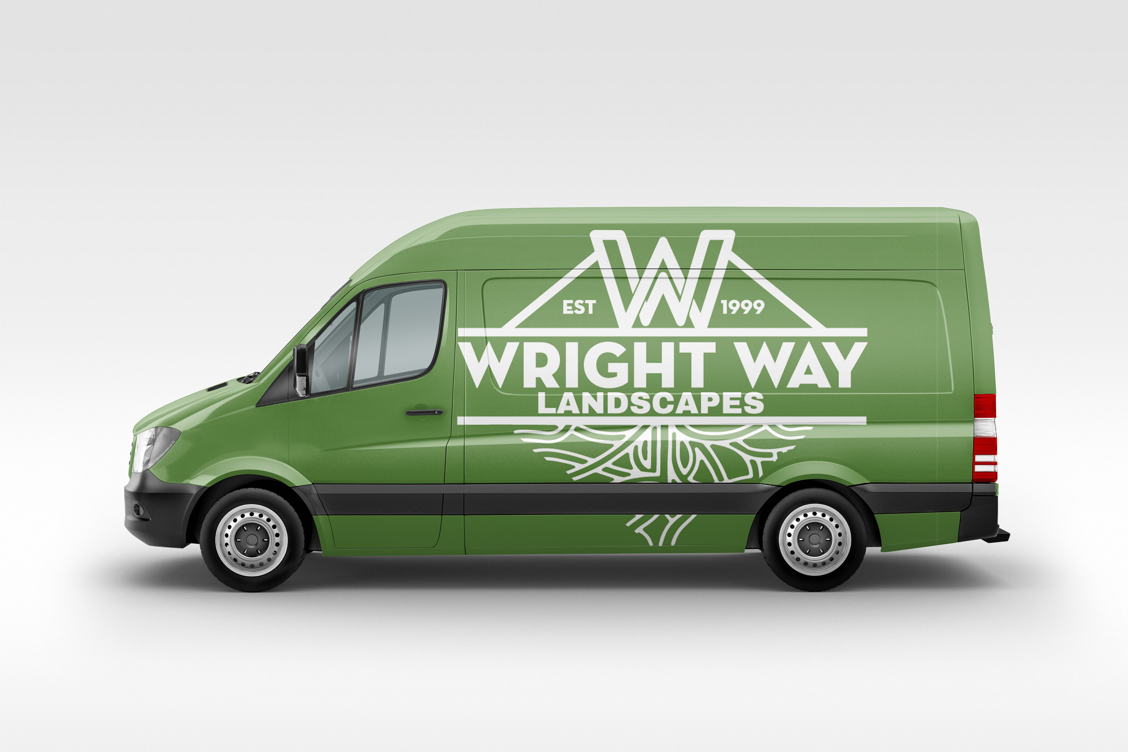
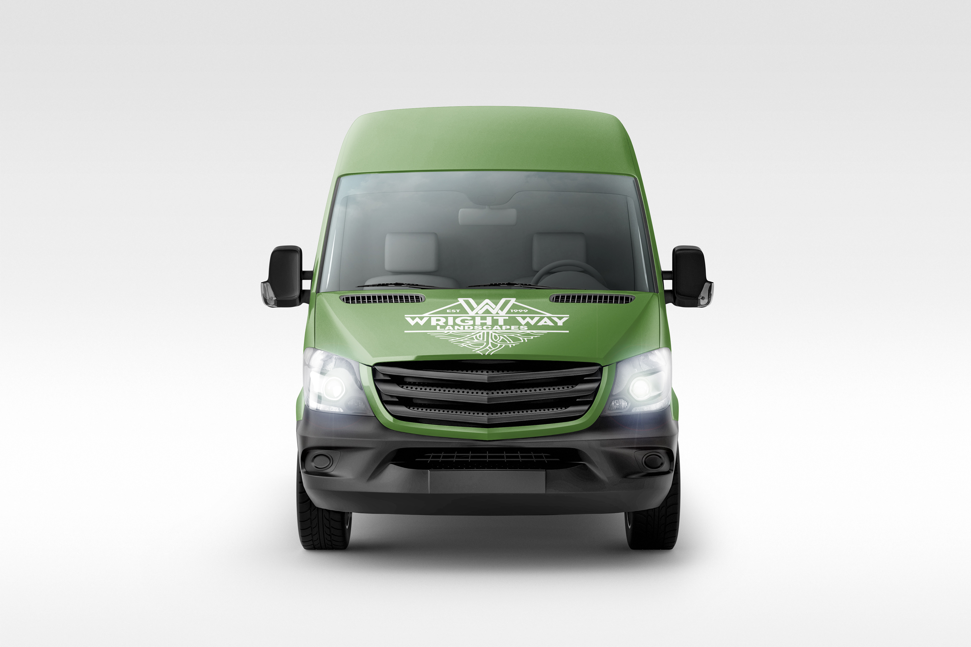
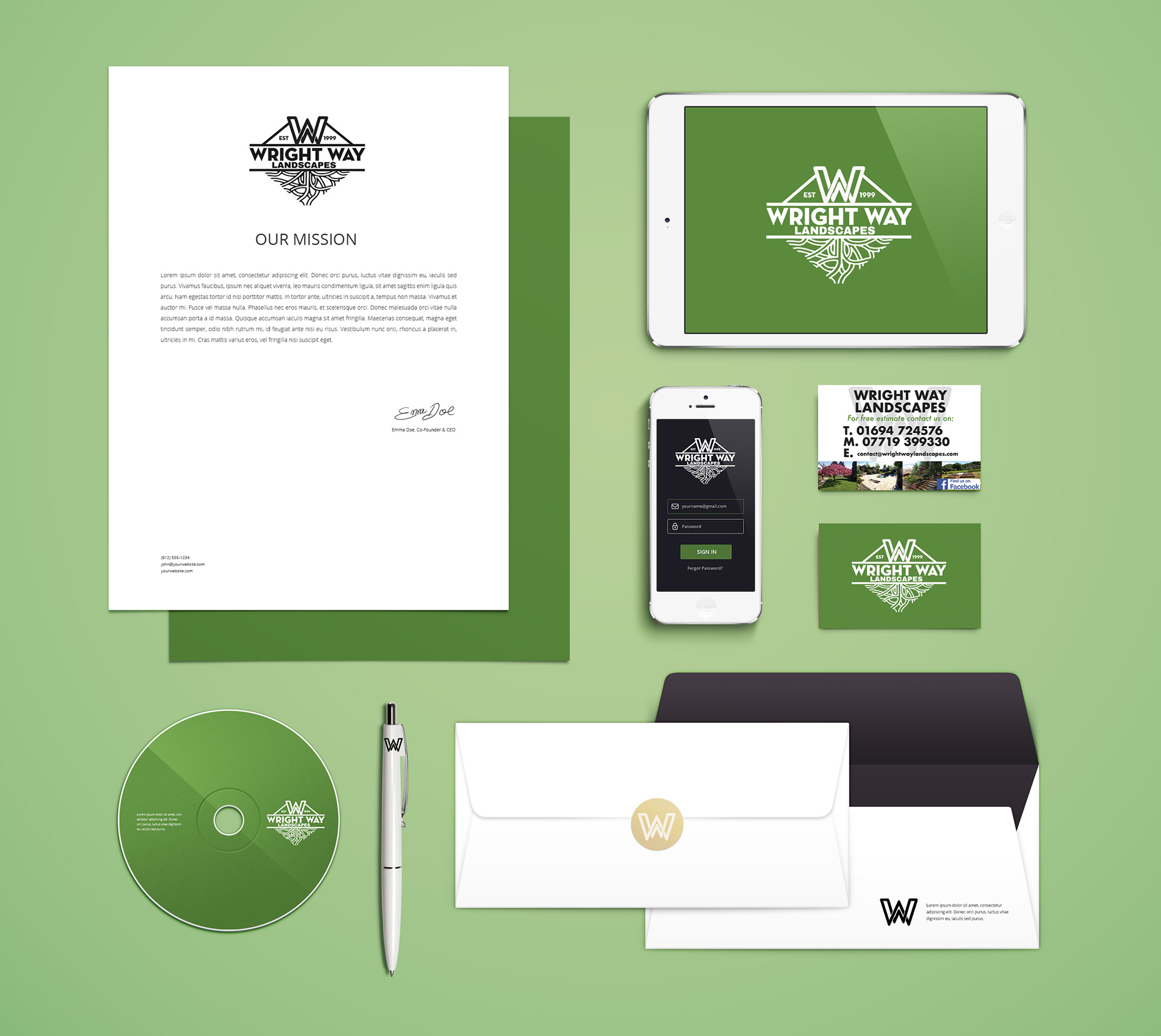
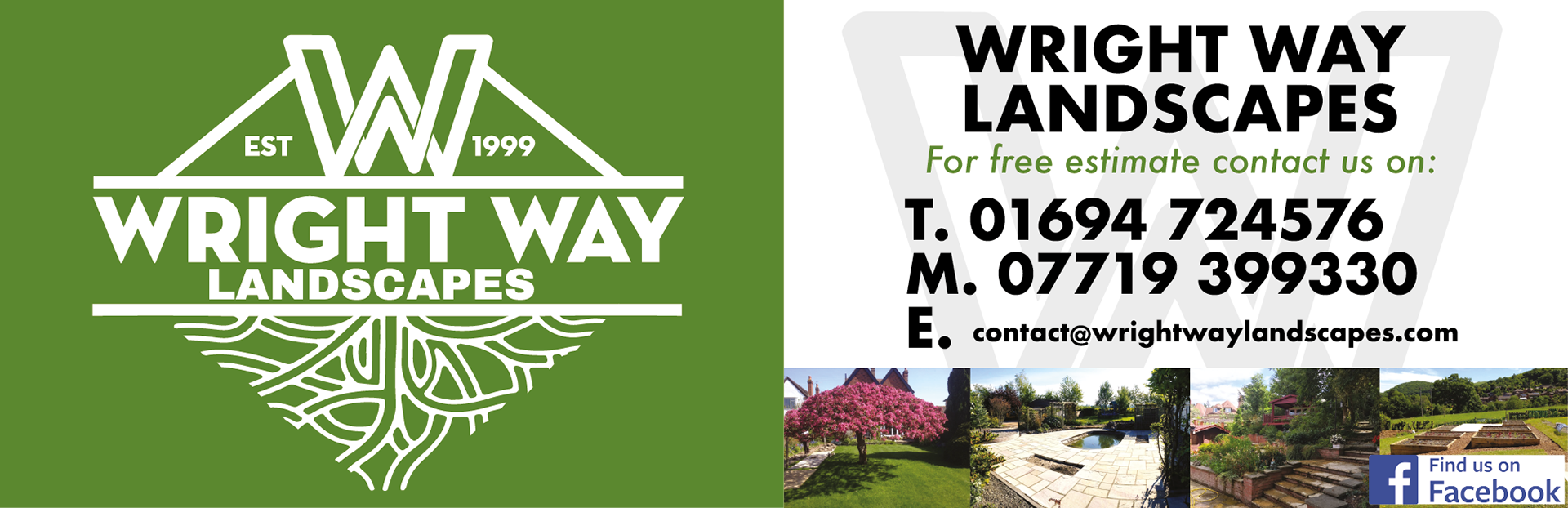
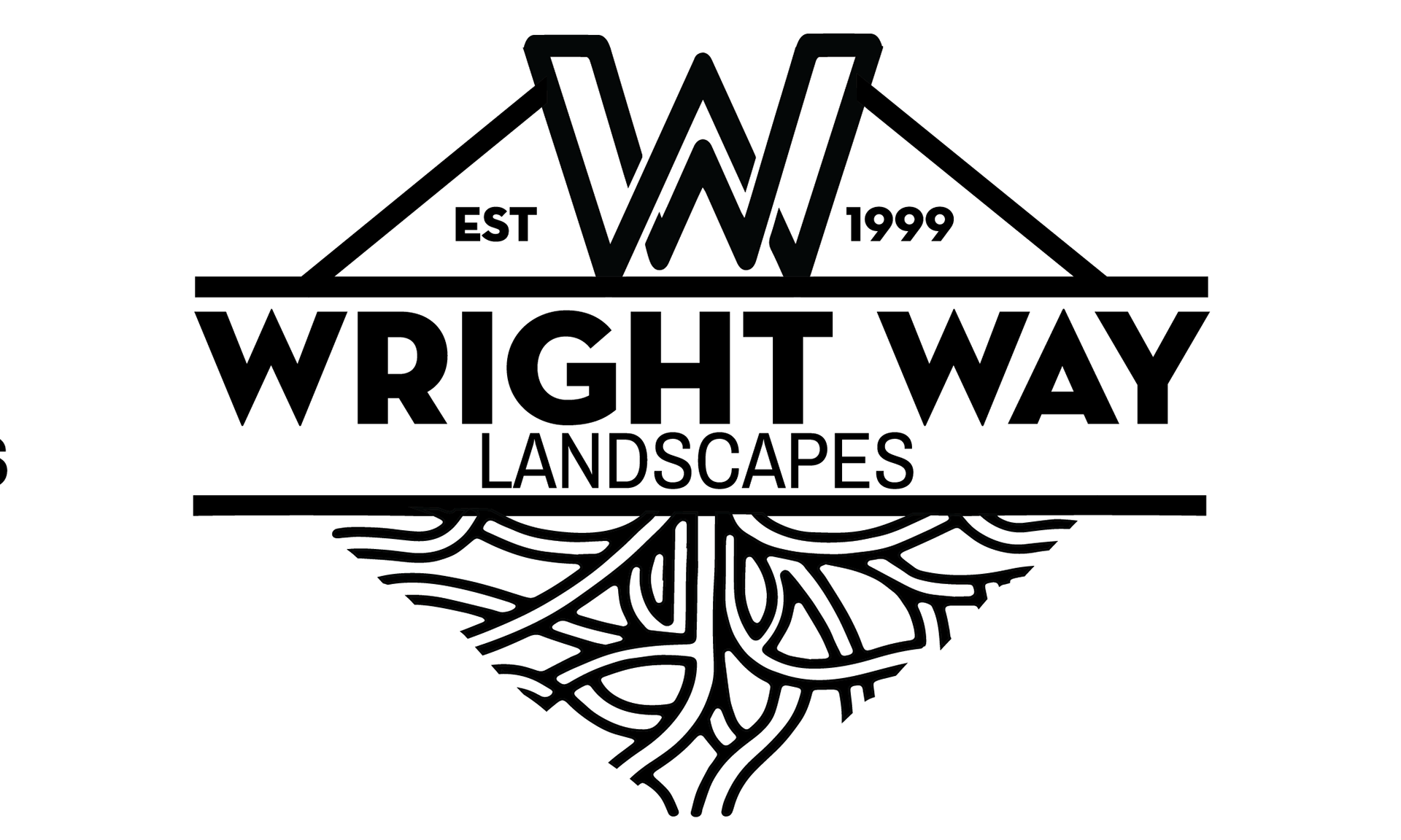
Wright Way Landscapes is a family-run company who approached me to re-brand their business. The previous logo design was slightly out-dated, so they asked for something modern that would help the business stand out from the crowd.
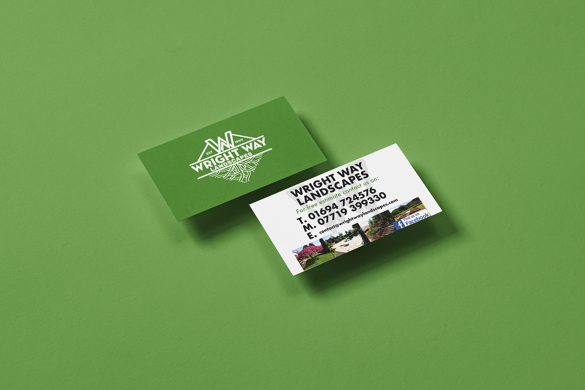
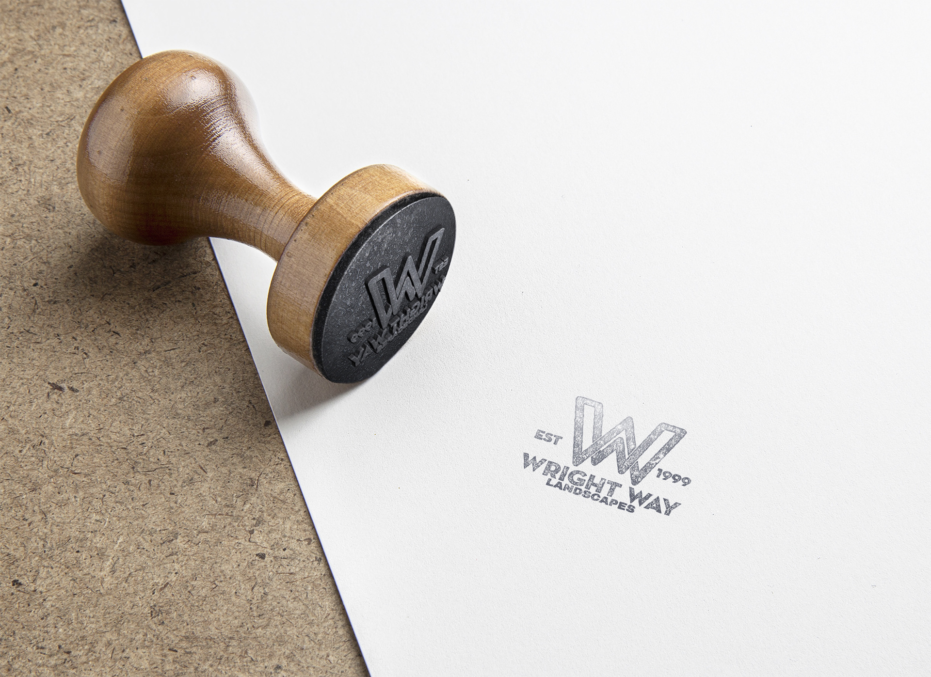
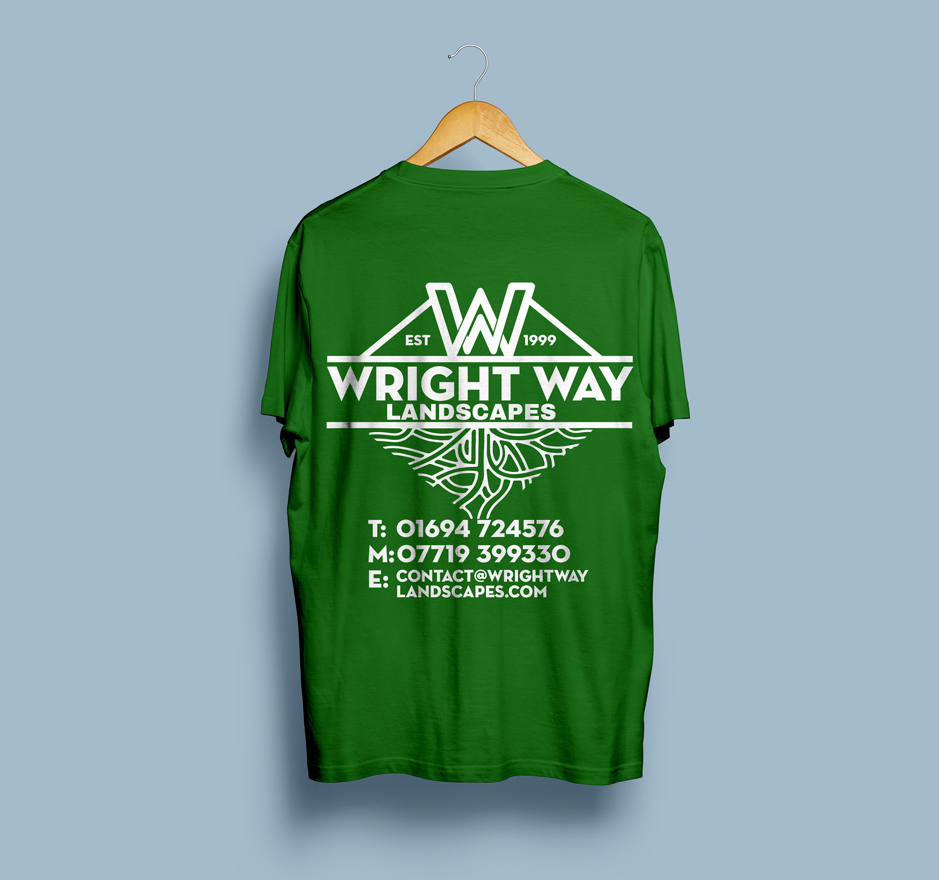
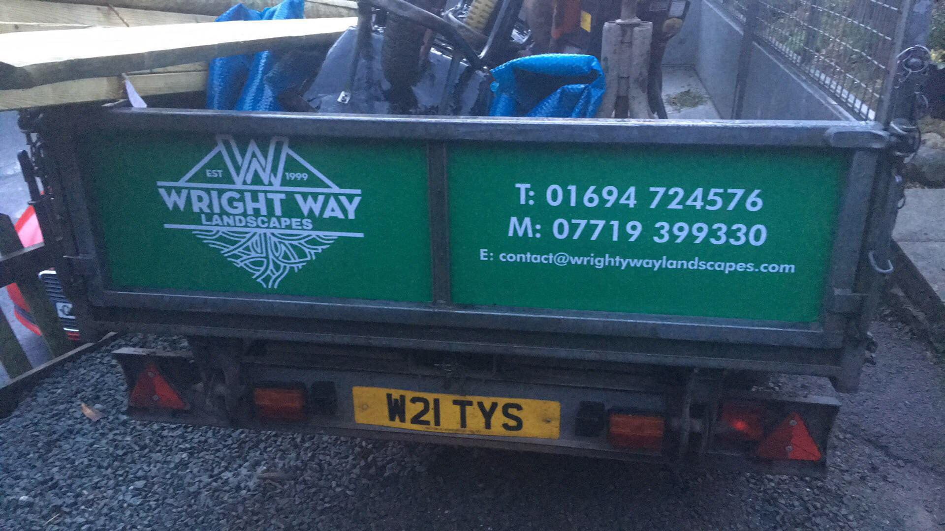
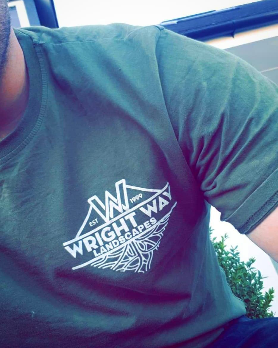
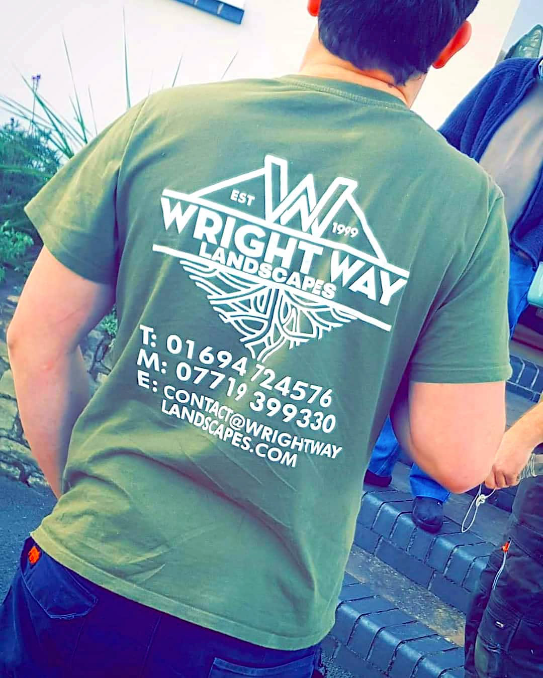
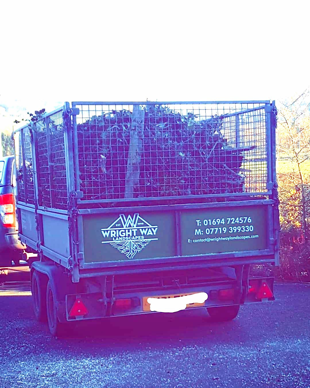
The two W's play with the alliteration of the company name 'Wright Way' and can be used as a minimal logomark on its own to adapt for smaller stationary, social media and print.
Illustration of stylised tree roots mirror the shape of the top part of the logo and provide an aesthetic touch.
The colour palette for the brand uses a deep, forest green that represents the nature of their work in gardens and the bold white reflects the clean and precise work they do.